
In response to the growing number of searches performed on smartphones, Google is changing how it indexes websites to improve mobile usability.
On July 1, 2019, mobile-first indexing became default for all new sites on Google, and according to its latest announcement, Google aims to move all existing websites to mobile-first indexing by September 2020.
Since Google put a deadline on the mobile-first transition, the time is now to ensure your site is mobile-friendly to avoid any negative impact on your indexation and ranking.
Let’s dig into how you can optimize your site for mobile-first indexing to prepare for the change.
First: What is Google’s mobile-first indexing?
Mobile-first indexing means Google primarily uses the content that you serve on mobile to index and rank your site. In other words, Googlebot indexes your content as a mobile user (using a smartphone user-agent instead of a desktop) to determine your site’s relevance to a searcher’s query.
How can I check whether my site has moved to mobile-first indexing?
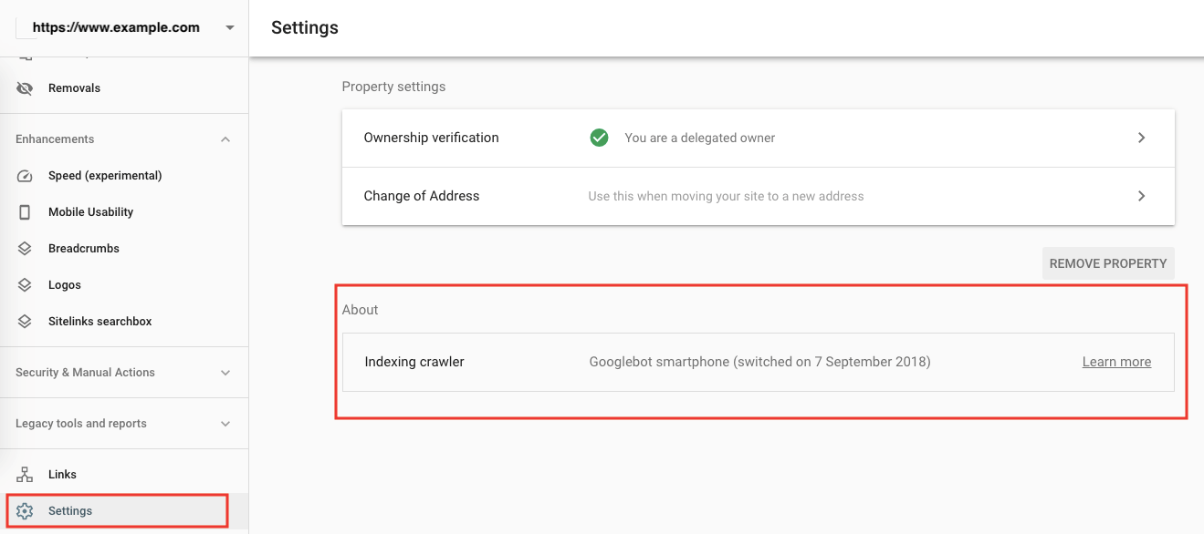
You should verify your site on Google Search Console, both the mobile and desktop versions if they are different, so that you can see when your site has been switched to mobile-first indexing.
Simply select your property on the Search Console, go to Settings, and under About, your site crawler will specify Googlebot smartphone with a date indicating your mobile-first indexing switch (in brackets).
 How to check mobile-first indexing on Google Search Console
How can I improve my ranking after mobile-first indexing?
With mobile-first indexing, the best practice is to have a site that serves only one URL version to users regardless of device but with a responsive web design that adapts to various screen sizes.
If you already have this in place, the impact of mobile-first indexing on your ranking should be subtle to none. The change simply means Google will use its smartphone-like bot instead of its desktop bot to index your one and only site version.
On-page optimization methods to improve ranking, such as researching keywords according to search intent, writing content around target keywords, and incorporating those keywords in the page title, meta description, and content headings (H1), remain the same with mobile-first indexing.
We also still suggest indicating the canonical version of duplicate content and pointing out alternative language versions with hreflang.
One notable optimization with mobile-first indexing is to pay closer attention to how mobile-friendly your images and videos are. This goes beyond standard optimization and includes using descriptive image alt tags, captions, file names, and titles.
Alongside responsive web design, Google recommends the use of responsive images. Depending on screen size, you can either suggest Google to load different image size using the <img srcset> attribute or use the <picture> element to modify image cropping. Here’s more on how to set responsive images.
Use a supported format for image and video and refrain from using a constantly changing URL for your media resources in every page load.
My site has a separate mobile version. How can I optimize it for mobile-first indexing?
If you have a separate mobile version (commonly an m-dot site), depending on how your site is optimized, you may notice some changes in ranking as Google favors the mobile site for indexing.
Here are a few points to keep in mind:
- Each desktop page that you want to rank should have a corresponding mobile page. You should have the same content, especially for:
- Metadata, like page title and meta description
- Structured data
- URLs to resources, like image and video content
- Ensure your page delivers the intended status code. You do not want your mobile page to serve an error 404 page while the desktop is serving a status 200, as Google will only index the error page and your content will be missing from the index.
- Make sure Google can access and render your mobile page content and resources by not limiting Googlebot with directives, like a noindex or nofollow meta robot tag or disallow txt.
- Help Googlebot understand that it should treat your desktop and mobile page as one entity with the same content, but either one should be ranked accordingly depending on the user’s device.
You can do so by adding a rel=”canonical” tag to the desktop URL on the mobile page and adding a rel=”alternate” tag pointing to the mobile URL on the desktop page.
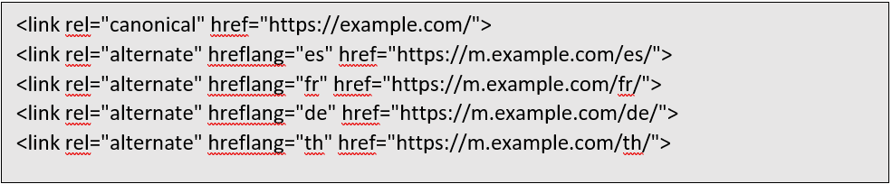
Nonetheless, hreflang should still refer to the mobile and desktop language versions separately.
The end result should look something like this. Taking a code directly from Google’s example, if your mobile URL is https://m.example.com/, then you should annotate your page HTML with:
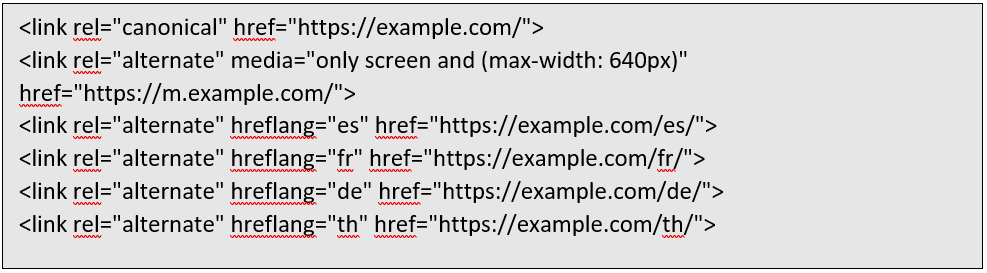
While on your desktop URL https://example.com/, your HTML should have:
Now that you know how to optimize your site for mobile-first indexing, below are some tools that you can utilize to gauge your mobile usability.
How can I check if my site is mobile-friendly?
Here are 2 quick ways to do so:
- You can use the Google Mobile-Friendly Test to check one URL at a time. Upon checking, the tool gives you a status and a list of fixes that you can make to improve your mobile usability.
- Alternatively, go to the Mobile Usability Report on Google Search Console to see mobile-friendliness test statuses and fixes for your entire site. As mobile-usability is one of Google’s ranking factors, it is important to revisit this report from time to time.
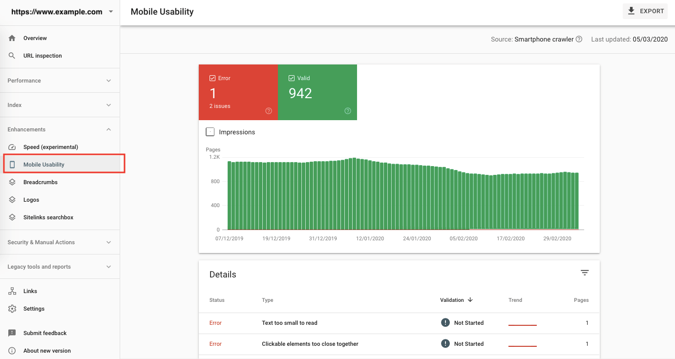 Mobile usability report on Google Search Console
Where can I test if my webpage is responsive?
Using Google Chrome on desktop, you can check if your site is responsive on smartphones and other devices by right-clicking on the page. Go to Inspect and click on the smartphone icon on the upper right corner. You should see a Responsive drop-down that lists various devices so that you can see how your page is displayed on various screen sizes.
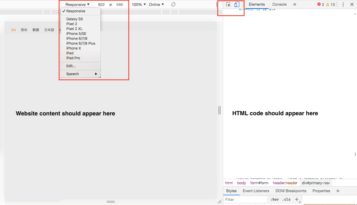
Where to test on desktop if your webpage is responsive
***
With more and more people searching Google on their smartphones, it’s imperative that your site serves content optimized for mobile viewing. As Google responds to this trend, sites that don’t optimize for mobile will be left behind.
Need help to improve your ranking for Google’s mobile-first indexing?


