
Online form completions are a crucial source of conversions for many businesses, yet most pay little-to-no attention to form design. Form design seriously impacts the user experience (UX), and each form element has the power to alter your overall conversion rate.
(Some form elements, such as multiple text inputs, can even slash a form’s conversion rate in half.)
There is much value in optimizing your contact form design for a higher conversion rate. You can do so by following established UX principles.
We’ve put together a list of 10 UX best practices for form design to help you boost your conversion rates.
1. Localize your form
Always localize your contact forms to match the input formatting practices of your target market. Providing users with a seamless experience can minimize user frustration and form abandonment. There are several form fields that can be optimized for local users.
Customize address fields
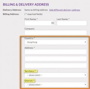
Marking fields such as State and ZIP/Postal Code as required can be troublesome for users living in countries that do not use such metrics. For example, there are no postal codes in Hong Kong.
Instead it is useful to obtain information on the territory or district you’re targeting. Your forms should detect or ask for a user’s location first, and then customize address fields to the country-specific location of the user.
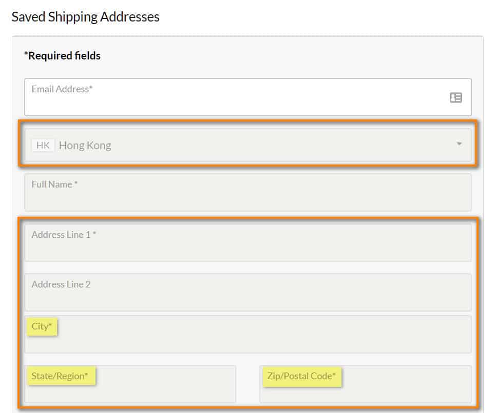
A form with mandatory State and ZIP/Postal Code fields (left) versus a form with address fields that match Hong Kong’s address formatting practices (right)
Format name fields appropriately
While the Name field may seem straightforward, there are differences between countries in how names are formatted. For example:
- In Hong Kong, people write their last name before their first name, yet many forms ask for the user’s name in the opposite order. So, if you’re targeting Hong Kong, format last name then first name.
- In many European countries people may have multiple middle names, so forms should accommodate this by removing character limits from the First Name or Full Name.
Automatically add country code to phone number field
When a form appears on a country-specific page, or when the user is required to select a country within the form, the phone number field should detect the country selection and automatically provide the correct country code in front of the input field.
This minimizes user effort and prevents any errors with the phone number formatting.
2. Label only the optional fields
Marking fields as ‘required’ causes users to focus their attention only on what’s important, while making them inclined to skip all optional fields. A better approach is to label only the optional fields.
Studies have shown that users are naturally inclined to voluntarily over-disclose when filling out forms, making them more likely to fill out optional fields when they are emphasized.
3. Minimize user effort for data input
Users generally want to put in as little effort as possible, which means the number of text fields in a form can have a huge impact on the conversion rate. One study found that the conversion rate dropped by nearly 50% when they increased the number of text areas in a form from 1 to 3.
The perceived effort to fill an empty form field is high, as typing is time consuming (especially when using a touch screen) and prone to errors. This makes users much more likely to abandon form completion.
Therefore, avoid using more than one text input field in your forms. Text areas can be replaced by more user-friendly input types, such as checkboxes, drop-down menus, and radio buttons.
4. Use a single column layout
We can leverage findings from eye-tracking tests to speed up form completions: A form with two or more columns requires the user to scan the form in a Z pattern, which can cause confusion on the completion path and slow down the comprehension speed. And the longer a user takes to complete a form, the more likely he or she is to abandon it.
It is safest to eliminate this problem by organizing your forms into a single column, which minimizes the cognitive load.
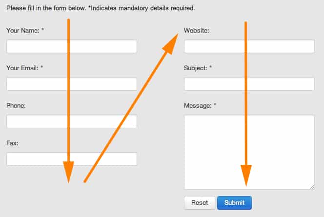
Our eye movements when filling in a two-column form (left) versus a single column form (right)
5. Place labels above fields
Forms must be easily scannable to speed up completion. Studies have shown that positioning labels above input fields is most effective in increasing completion speed, as this best matches our natural eye movements and reduces the cognitive load.
6. Use caution when using placeholder text
In addition to placing a label above its field, using placeholder text can also work to speed up completion, if the placeholder text moves above the form field upon field selection.
This is called a floating label. If the placeholder text is not formatted as a floating label, the text disappears upon field selection, which can be inconvenient as the user may not remember what the field is supposed to contain.
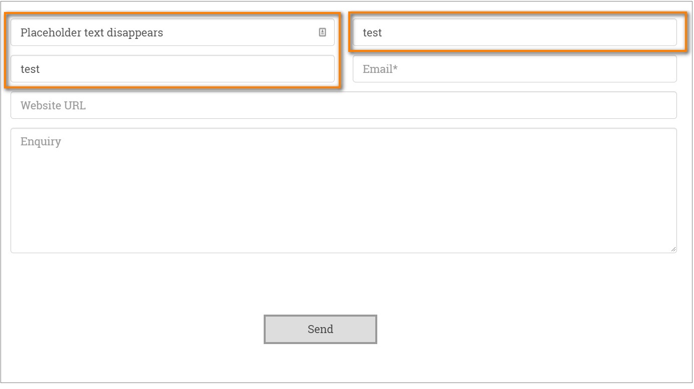
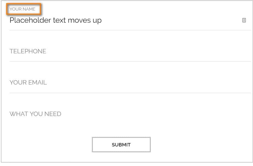
Fields where placeholder text disappears (left) versus fields with floating placeholder text (right)
7. Always explain why when asking for personal information
Most people are hesitant to give out their personal information when filling in forms, especially sensitive information like a phone number or an address.
Users who question your form’s need for certain information are very likely to abandon the form or fill in false information.
Therefore, you need a good reason to ask for personal information, which should be communicated to users using an infield information button, for example. This button should explain why you are asking for personal information to create trust between you and the user and to address any preliminary concerns.
8. Don’t ask for a phone number if it’s not necessary
Many users are wary of giving out their phone numbers as they do not want to receive unexpected sales calls or have their data added to telemarketing lists.
One popular study found that marking the phone number field as ‘optional’ rather than ‘required’ nearly doubled a form’s conversion rate, while improving the form abandonment rate from 39% to just 4%.
Always try to give your users a choice between providing either their email address or phone number. Mark the phone number field as ‘optional’, or completely eliminate the field if this data is not crucial to the next step in your sales process.
9. Steer clear of captchas
Captchas are used to manage spam and bots. However, using captchas is not the ideal method for managing spam, as it forces the burden of spam prevention on your form’s users.
Although designed to be easy for humans to complete, studies have proven that captchas are harder to solve than we may have expected. Failure to complete a captcha causes user frustration and increases form abandonment rates.
Form UX can easily be improved by eliminating captchas and using alternative spam management solutions, such as adding hidden fields that only spam bots can access or using cookies to set session tokens.
10. Use form validation
User errors are inevitable, despite the measures to prevent them. Using form validation is important to prevent the submission of incomplete or invalid forms caused by user error.
Validation elements should ideally notify a user of any errors after the user clicks on the submit button.
Studies have found that fewer errors are made when form fields are validated after clicking the submit button, compared to instant validation that occurs before clicking submit. In addition, post-submission form validation reduces user frustration, user error, and form completion times.
If you have to notify users before clicking the submit button, for example for password fields, be careful not to notify your user at the wrong time. Notifying your users too early can be a nuisance, as errors are often falsely indicated before the user has a chance to finish typing.
As a rule of thumb, ensure that validation messages appear at approximately 500ms after a user has stopped typing in that field.
There are 4 other steps to take when implementing contact form validation:
-
Provide a solution to the error
Make it as simple and fast as possible for the user to correct his or her mistake. For example, if a user has used letters in a phone number field, point out that letters were used while only numbers are allowed.
-
Match error messages to the corresponding field
Placing error messages next to the corresponding fields rather than compiled at the top of the form reduces the cognitive load. It is also more intuitive and hence leads to faster corrections.
-
Provide error messages on the right side of the field
When matching error messages to the corresponding field, it is best to position them on the right side of the form field. Users have rated error messages on the right side of a field to be the most satisfying, as they impose the lowest possible cognitive load, and it flows with the natural reading direction.
-
Use help indicators when necessary
Help indicators are often depicted as question marks, which show information on what to fill in a field upon hovering over them. Help indicators are useful when asking for more complicated or ambiguous user input, such as a CVC code. The help indicator can tell users where to find the required input information, which in this scenario would be on the back of their credit card.
Bonus Tip: Track Your Form’s Performance
After following all these form design best practices, it is important we start tracking the actual performance of our newly optimized form.
There are several free tools available that can help you better understand how users interact with your form. Some of these tools allow you to conduct A/B testing, a process in which two different versions of your form can be compared to collect empirical evidence on which version converts best, while others help identify in which fields users tend to drop off.
All of these tools help you to pinpoint problems or pain areas in your fields to improve, so that you can create a better user experience in your forms:
-
Hotjar
The free version of Hotjar, Hotjar Basic, allows you to track up to 3 forms. Hotjar tracks how users interact with your form, showing you valuable metrics, such as overall conversion rate, dropoff percentage per field, average interaction time per field and blank field count. This helps you identify obstacles within your form on which you can improve.
-
Google Optimize
Google Optimize is a free tool by Google that provides an easy-to-use platform to run A/B tests on your site. This tool helps you track the performance of 2 different versions of your form, for example a version with a phone number field and one without. You can then easily see which version leads to the most form completions, allowing you to support your research and improvements with emperical evidence.
-
Google Analytics + Google Tag Manager
Google Analytics, for those who use them, provide conversion data for all your forms, as long as the act of completing it is set up as an Event or the Thank You page is set up as a Goal. Google Tag Manager takes this further by enabling you to set up custom tags to track user interaction with your forms, which can be reviewed on Google Analytics. This allows you to gain insights on user behavior, such as which form fields people interact with the most and where users drop off.
These free tools help you track, test, and develop a form that best suits your individual business needs, as form optimization is not a one-size-fits-all process.
From attracting leads, to gaining email newsletter signups, survey participation or file downloads, each form on your site serves a unique purpose and will have different UX elements to customize. So keep on testing and discover which of the recommendations above helps you attain your business goals.
Making efforts to improve your form UX will naturally result in happier users, more form completions, and thus a higher conversion rate.