7 Proven Steps to Improve your Landing Page Conversion Rate
Landing page optimization helps to convert your site visitors into business customers with a smart, straightforward UX.
On the flipside, a landing page that’s left unoptimized with a complex, distracting design can cause potential customers to miss–or altogether abandon–your call-to-action.
Here, let’s explore the seven steps to increase your landing page conversion rate.
What is a landing page?
A landing page is a standalone webpage created specifically to achieve a campaign goal and serve as a website entry point for a particular purpose.
It is where visitors land after clicking on links to your site from an array of traffic sources, like social media posts, paid media banners, email links, Google’s organic search results, and more.
In short, a landing page is built to drive traffic for a specific marketing goal, like blogging SEO, ad campaigns, social backlinking, etc.
Furthermore, landing pages generally have a single call-to-action (CTA) to encourage a desired outcome for the user, whether that’s filling their contact details, signing up for newsletters, or making an online purchase.
From in-text hyperlinks to clickable buttons, CTAs come in many forms and instill a sense of urgency by giving users some direction of what step to take next. Some examples include:
- “Sign up now”
- “Read full article”
- “Get offer”
- “Learn more”
- “Subscribe”
- “Shop now”
- “Buy now”
How do landing pages differ from regular webpages?
Unlike webpages, which typically have several goals and encourage exploration, landing pages are designed with a single focus: to convert visitors.
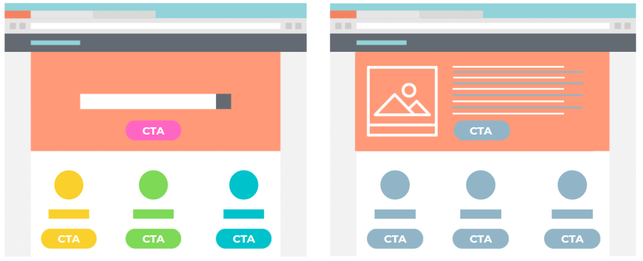 Example of a webpage with multiple CTAs (left) versus a landing page with a single CTA (right)
To illustrate the purpose of regular webpages versus landing pages, consider the three main stages of the customer journey:
- Awareness
- Consideration
- Decision
Regular webpages generally serve the first two stages, while landing pages primarily target users in the final stage of the customer journey: the purchasing decision.
WHAT IS A GOOD LANDING PAGE CONVERSION RATE?
As a digital-savvy marketer, you are likely aware that landing page conversion rate is an important metric to assess your overall marketing success. But what is a good landing page conversion rate? According to Wordstream, the average landing page conversion rate is around 2.35% across industries, while the top 25% are converting at 5.31% or higher. More impressively, if you look at the top 10% landing pages, the conversion rate for them is a whopping 11.45% or even higher.
So, how do you break into the top 25% or even top 10% highly converting pages? We will delve into the seven tried-and-tested steps to achieve that.
7 STEPS TO IMPROVE YOUR LANDING PAEG CONVERSION RATE
The objective of a landing page is to signal to your visitors:
- What you want them to do, and
- Why they should do it
To communicate this in a way that resonates with visitors, you must consider several messaging and visual elements in your landing page structure to improve conversion rates and, ultimately, generate better quality leads.
Here, we’ve used Grab’s driver-partner landing page to illustrate how to optimize various elements on the landing page to improve conversion rate.
STEP #1. WRITE AN ATTENTION-GRABBING Headline
The headline is the first eye-catching element that visitors read when visiting a landing page, so it should be attention-grabbing and inform visitors what the page, product, or service is about.
Below, notice how Grab deploys a strong headline that is compelling, digestible, and succinct.
Grab’s driver-partner landing page: Headlines
Alt txt: The headline in Grab’s driver-partner landing page
STEP #2. USE AN APPEALING Hero Image IMAGE THAT ACCENTUATES THE CONTENT
The adage “a picture is worth a thousand words” is especially true for landing pages given the shorter attention spans of internet users today. As the hero image is the first visual element visitors see on your landing page, another adage proves true here: “Show, don’t tell.” Using the hero image to show context rather than tell with text has a strong positive effect that helps visitors empathize with your product or service.
To contextualize your message, use photos or videos that showcase your product or service’s selling points to grab your target audience’s attention.
 Grab’s driver-partner landing page: Hero image
WANT DIGITAL INSIGHTS STRAIGHT TO YOUR INBOX?
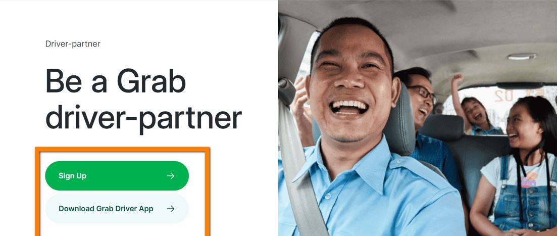
STEP #3. WRITE A STRONG CTA THAT PROMPTS USERS TO ACT
CTAs (call-to-actions) encourage a desired response from users. And for landing pages in particular, there should only be one main action-oriented conversion goal.
CTAs should be crisp, persuasive, and designed (i.e., via font, colors, design elements) so that they stand out on your landing page. With clear and direct CTAs, everyone wins: Your visitors become paying customers, and those customers get what they’re looking for.
Here are some actionable CTA buttons that Grab uses on its landing page:
Best Practices For YOUR CTA:
- Keep your CTAs short and sweet—and to the point.
- Use attention-grabbing colors and combinations.
- Use buttons instead of in-text links.
- Make them actionable.
- Conduct A/B testing to determine which CTA designs or copies perform better.
Meanwhile, Grab’s main CTA is attention-grabbing, while the secondary one is much more subtle.
Grab’s driver-partner landing page: Example of CTA buttons
Alt txt: The CTA buttons of Grab’s driver-partner landing page
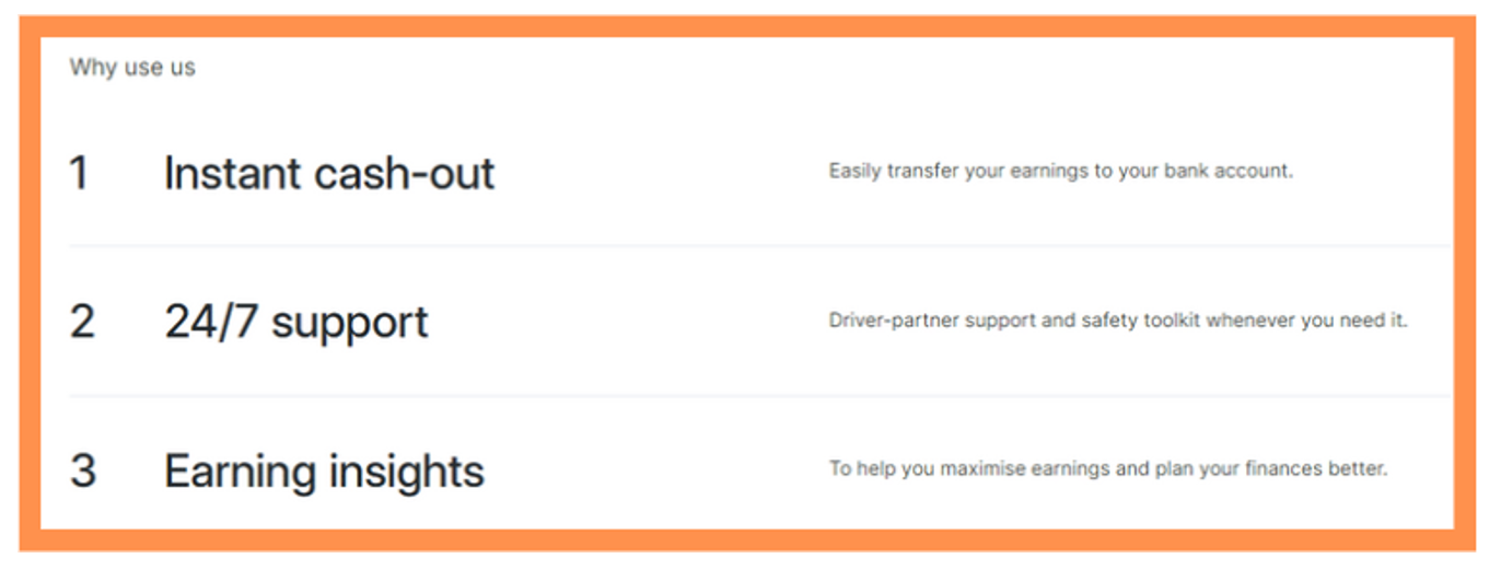
STEP #4. BUILD A FEATURE LIST THAT EMPHASIZES BENEFITS
To convert more visitors, you will need more than a headline and CTA buttons.
A feature list on your landing page helps convince your visitors of the perks of your product or service and motivates them to convert.
Remember that your feature list should be benefit-oriented, functional, and clear in communicating your product or service.
In the case of Grab, its feature list is simple, easy to understand, and benefit-oriented. Users can easily understand the perks of becoming a Grab driver.

STEP #5. INCORPORATE Social Proof TO BUILD TRUST
Before purchasing a product or service, people usually want to hear about the experiences of those who came before. So, by establishing trust and credibility, social proof is one of the most effective conversion tools.
Examples of social proof on your landing page may include:
- Client testimonials
- Case studies
- Video interviews
- Featured client logos
- Reviews (Yelp, TripAdvisor, Google, etc.)
On Grab’s landing page, the testimonial section highlights key information, including the reviewer’s:
- Name
- Profile picture
- Duration as a client/user
STEP #6. ADD A Fine Print TO EASE THE PROCESS
The fine print section of a landing page refers to the details of a contract or offers relating to your product or service.
In Grab’s landing page, for instance, the fine print section details the entire procedure for how to successfully register as a partner driver.
STEP #7. USE FAQs TO ADDRESS USERS’ CONCERNS
An FAQ section is a collection of commonly asked questions that relate to anything about your product or service, business operating hours, prices, delivery information, and more. They primarily serve to address any concerns or burning doubts users may have and reassure them of their conversion.
Grab’s landing page features an accordion-style (drop-down) FAQ section, which minimizes scrolling, makes content less overwhelming, and lets users control what they see.
***
Optimized landing pages can attract, convince, and convert more customers—and the above design and messaging elements can help guide you in creating them.
To know if your landing pages are as optimized as possible, they should ideally have low bounce rates and high conversion rates.