Google first introduced mobile-first indexing in 2016. In December 2018, Google announced that it will “now use mobile-first indexing for over half of the pages shown in search results globally.”
It is no doubt that Google is turning to mobile as its focus. So, the question becomes: is your website ready for such a drastic change?
In this article, we explain Google’s mobile-first indexing and what can you do to make sure your website is ready.
What is mobile-first indexing?
As its name implies, Google is prioritizing the mobile version of websites to be included in their search index.
Before mobile-first indexing, Google primarily crawled and indexed the desktop version of websites. But now, it primarily indexes the mobile version.
The mobile-first index is the only index that Google uses to serve search results now. Wherever you search, whether on desktop or on mobile devices, the search results are based on the same index, which is the mobile-first index.
As explained by Google, this update was implemented to provide a better experience for users who search on mobile devices. It’s no surprise that Google is paying more attention to mobile, as mobile devices are the major traffic source of Google.
Should I worry about mobile-first indexing?
If your website is already well-optimized for mobile devices, then you have nothing to worry about.
Still, as Google strives to provide a better experience for mobile device users, you should definitely do it too. Here are 4 tips for you to develop a mobile-friendly website and improve your website’s user experience (UX) on mobile devices.
1. Adopt responsive web design for your website

The Egg’s website adopts responsive web design
There are many ways to build a website that fits in mobile devices. You can adopt responsive web design, dynamic serving, or use a separate URL to serve content specified for mobile devices (the “m.” website).
For Google, these 3 methods are all acceptable. However, Google advises websites that use the last 2 approaches should follow some additional best practices to make sure they are ready for mobile-first indexing.
Therefore, to avoid difficulties for your website to be indexed by Google, we recommend adopting responsive web design. In fact, Google recommends using responsive web design too.
2. Don’t hide content from mobile users
When Google explained the reason why they are rolling out mobile-first indexing, it mentioned that:
“…our crawling, indexing, and ranking systems have typically used the desktop version of a page’s content, which may cause issues for mobile searchers when that version is vastly different from the mobile version.”
The key takeaway is – your website’s content in mobile should be exactly the same as the desktop version.
When developing the mobile version, some developers prefer to block certain resources from users. This could include JavaScript, auto-playing video, or long text that look redundant on mobile devices.
This might have been fine in past. However, with mobile-first indexing, it is not preferable by Google now.
Hiding this content from mobile devices also means that it will not be crawled by Google. Therefore, it is not recommended in terms of mobile SEO.
3. Check your website’s mobile usability
Now, we all know the importance of making our websites mobile-friendly. But how can we know if our website is mobile-friendly in Google’s eyes?
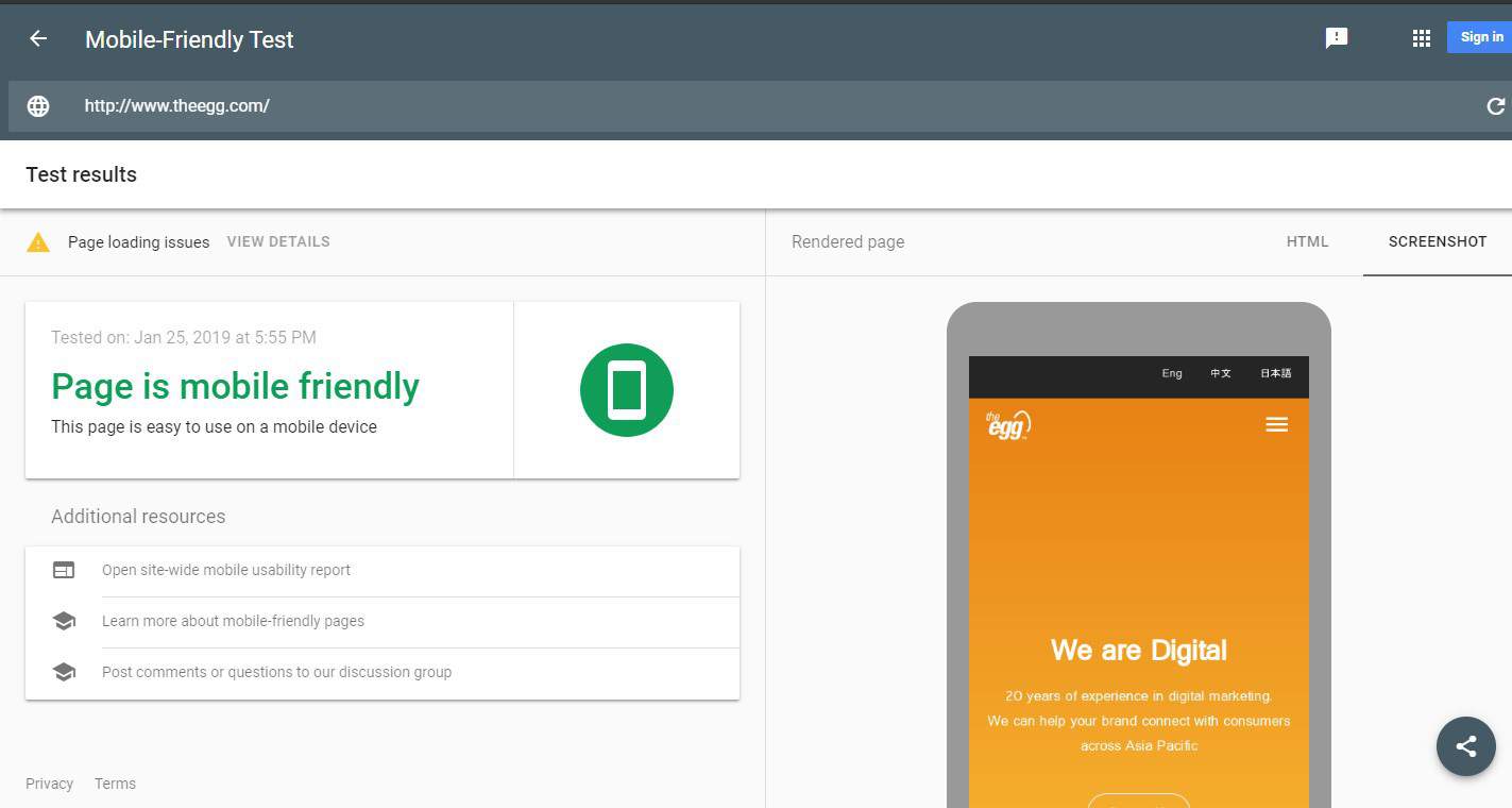
A Google tool can answer this question. In the Mobile-Friendly Test, simply input your website’s URL into the tool, and you will receive a report on your site’s mobile usability.
There are 3 main sections of the report. On the left side, it shows whether your website is easy to use on a mobile device. On the right side, there is a rendered page showing how Google’s smartphone agent crawls and renders your website. You can check if there is anything wrong or missing here.
After clicking page loading issues on the top left corner, there will be a list of page resources that couldn’t be loaded when Google’s smartphone agent crawled your website. The list shows the URL, resource type, and error status, such as “Googlebot blocked by robots.txt.” You can find out if there are any resources unintentionally blocking Googlebot and fix the issue accordingly.
If you want to dig deeper, you can click on open site-wide mobile usability report under the Additional Resources section. You will be redirected to a detailed mobile usability report in Google Search Console.
4. Make sure your content is easy to read on mobile devices
It is especially important to assure your content is easy to read when it comes to mobile devices.
When people are using mobile phones, they become easily distracted by phone calls and app notifications. To cope with such short attention spans, your content should get to the point quickly and should be scannable with subheadings.
Moreover, when people are reading on mobile devices, they are reading on comparatively smaller screens. To make your content easier to read, you can follow these formatting guides:
- Use larger font size—at least 14px font.
- Headings and subheadings should be bold.
- Make your paragraphs shorter—no more than 3 sentences in each paragraph.
- Each sentence should be as short as possible.
- Use bulleted and numbered lists to present your points clearly.