Google Data Studio: A Five-Step Beginner’s Tutorial
Google Data Studio (now called Looker Studio) is a free-to-use analytics tool that lets you visualize your data in fully customizable dashboards and reports that are informative, easy to digest, and highly shareable. However, like with most Google tools, it can be challenging for beginners—or even users who haven’t used it in a while—to pick up.
But don’t fret–we’re here to help! Read on for our five-step beginner’s guide to getting started on Google Data Studio and level up your reporting game.
Google Data Studio: Overview
What is Google Data Studio?
Google Data Studio is a data visualization tool that lets you create interactive reports using data from multiple sources and monitor them in real-time on a single platform. Its dashboards are excellent for monitoring your campaign performance, fulfilling your reporting needs, and evaluating your overall marketing efforts.
Benefits of Google Data Studio
There are many report-creating benefits on offer when using Google Data Studio, including its ability to let you:
- Connect data from multiple sources for a holistic overview of your marketing performance on a single platform
- Access free reporting templates and ready-made dashboards
- Create personalized reports with a wide range of customization
- Easily grant viewing and editing access to reports
Google Data Studio Pricing
With its many benefits and features, you will be pleasantly surprised to learn that Google Data Studio is completely free-to-use and accessible to anyone with a Google account.
An Introduction to Google Data Studio
Before we dive into the tutorial, let’s take a closer look at the Google Data Studio interface to get you familiar with the platform.
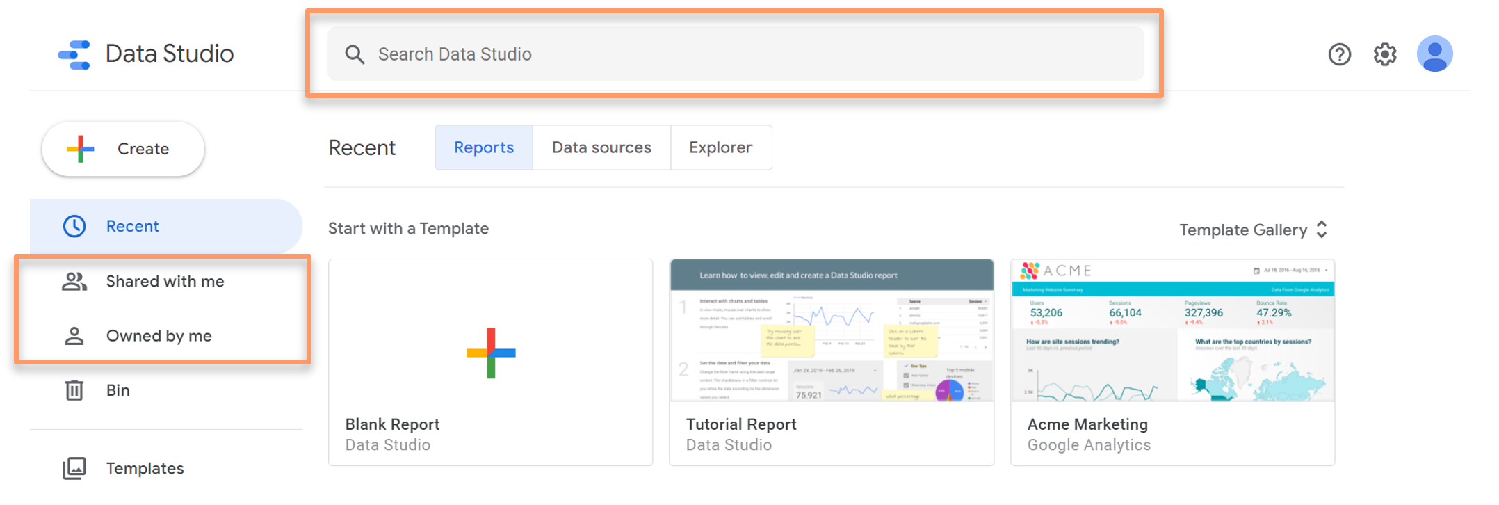
Google Data Studio: Homepage
Like with most Google products, you can create new reports and filter them by those others have shared with you or that you created yourself in the left-hand navigation bar.
The search bar at the top of the page lets you quickly fetch reports that you remember by name.
Just below the search bar are three useful tabs:
- Reports: The Reports tab lets you access all the reports that you created or were shared with you.
- Data sources: The Data sources tab displays a list of connections created between Google Data Studio and your data sources.
- Explorer: The Explorer tab is a tool that lets you experiment with tweaking how a chart appears without modifying it in the original report.
Google Data Studio: A Five-Step Tutorial
In this section, learn how to use Google Data Studio and create your very first report in five easy steps!
1. Create a Report
First of all, you need to create a report. There are many templates available to choose from and customize, but in this tutorial, let’s start with a blank one.
There are two ways to create a blank report:
- Click on the “Create” button on the left-hand navigation bar and select “Report”, or
- Click on the “Blank Report” option under the “Start with a Template” section
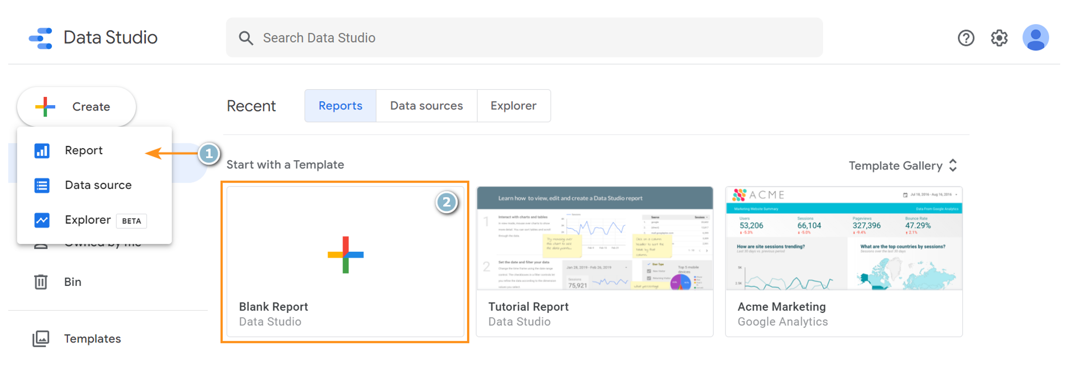
How to create a blank report on Google Data Studio
To view more report templates provided by Google, click on “Template Gallery” near the upper-right section of the interface.
2. Connect Your Data Source
Before creating any charts or tables, you will first need to connect a data source within Google Data Studio to give the platform access to the data required to build your report.
At the time of writing this article, Google Data Studio lets you access data from over 800 data sets and more than 620 connectors, including:
- Google Analytics*
- Google Search Console*
- Google Ads
- Google BigQuery
- Google Sheets
- Campaign Manager 360
- MySQL
- YouTube Analytics
*Important note: When connecting to data from Google Analytics and Google Search Console in Google Data Studio, you will need to connect each view and property one-by-one, respectively.
To add a data source to your report, click on the “Add data” button on the toolbar at the top of the report page, where you can select from an extensive list of available connectors.
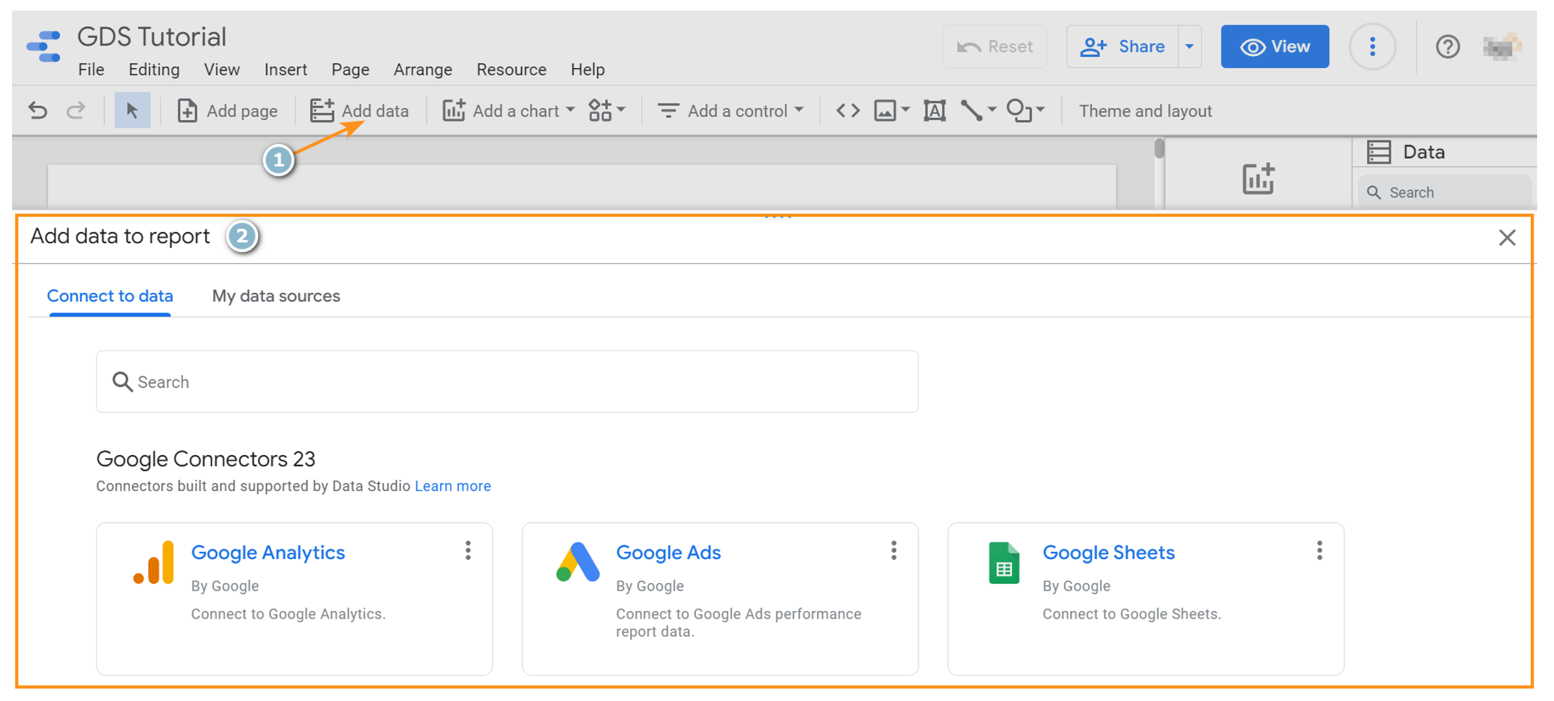
How to add a data source to your report on Google Data Studio
To delve deeper into the dimensions, metrics, and parameters of a particular data source you added, you can go to “Resource” on the top navigation bar and select it under “Manage added data sources”.
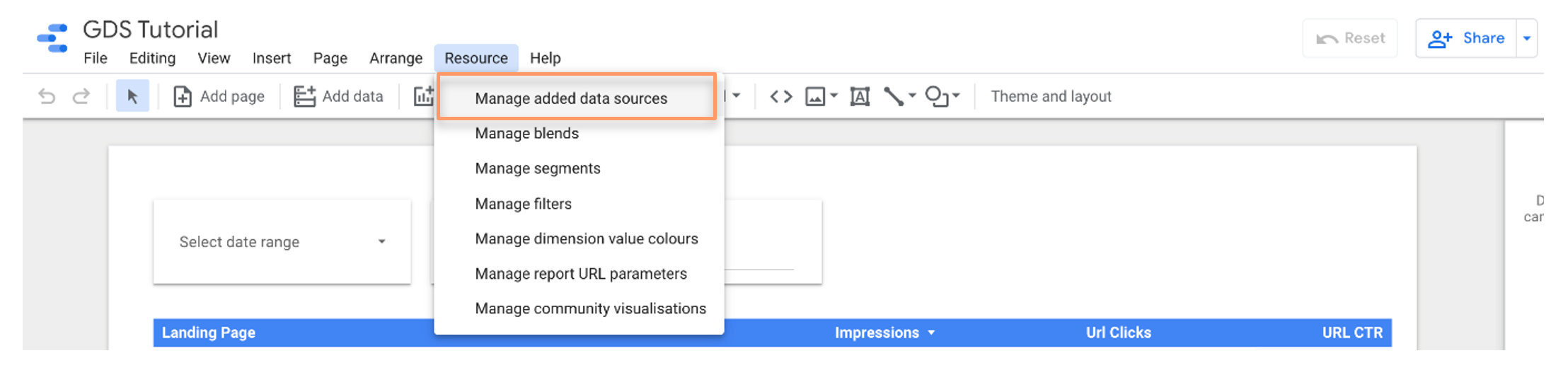
Select “Manage added data sources” to view your data source’s dimensions, metrics, and parameters
You will then arrive at a page displaying all the fields and parameters of your chosen data source.
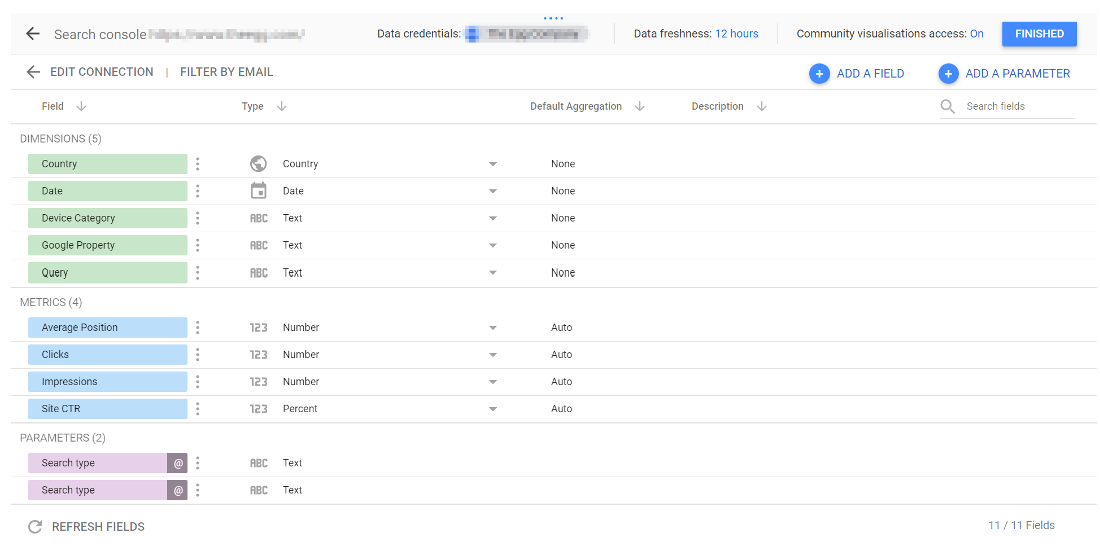
Manage your added data sources on Google Data Studio
Besides the default dimensions and metrics available, you can also click “Add a Field” at the top-right to create calculated fields. Calculated fields will let you create new dimensions and metrics—derived from your data—that you can display in your reports.
3. Visualize Your Data
Now that you’ve given Google Data Studio access to your chosen data source(s), it’s time to start building your report!
To begin, click “Add a chart” and select the chart type you would like to use in your report. There are many charts to choose from, ranging from standard tables, line graphs, and bar charts to more visual data representations like maps and treemaps.
Here is the full list of Google Data Studio charts available:
- Tables
- Scorecards
- Time series
- Bar charts
- Pie charts
- Google Maps
- Geo charts
- Line graph
- Area charts
- Scatter charts
- Pivot tables
- Bullet charts
- Treemaps
- Gauge charts
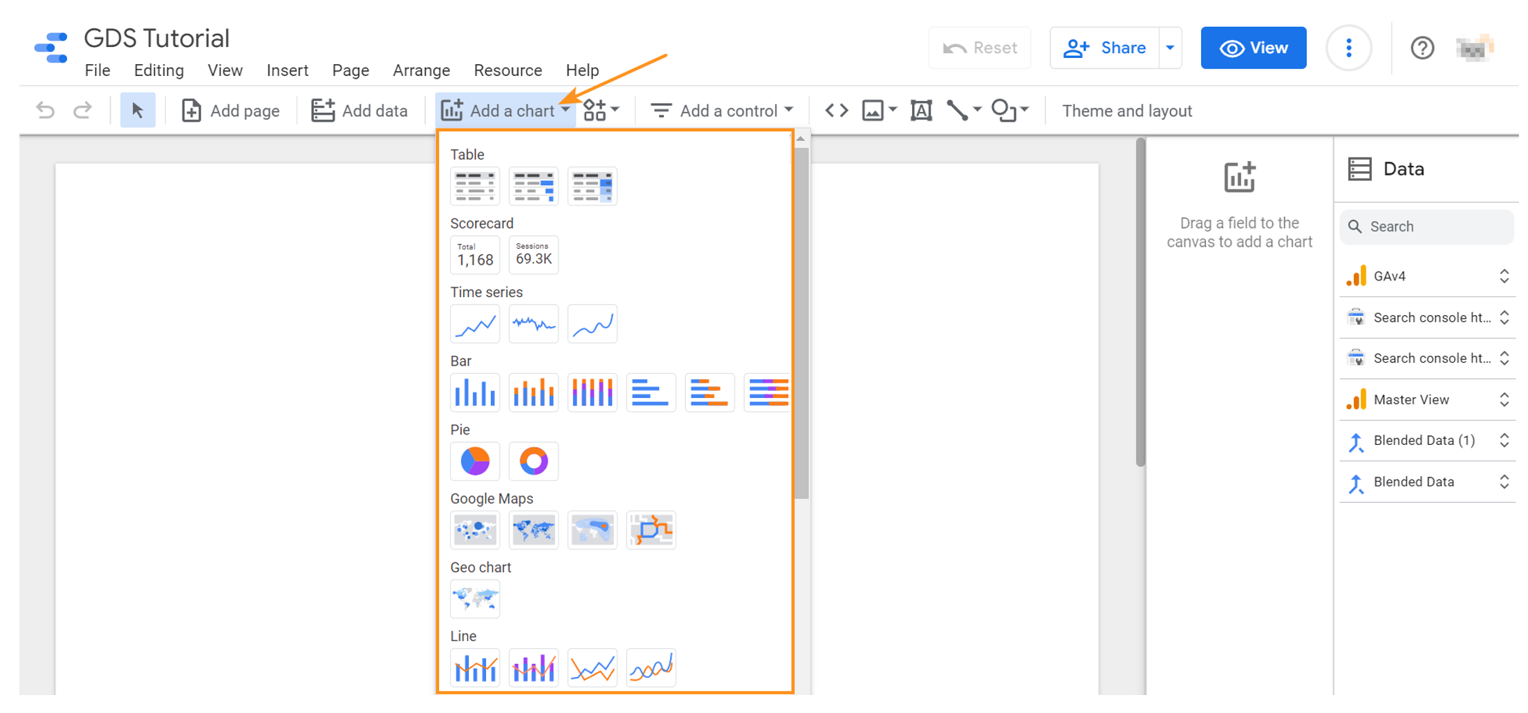
How to add charts on Google Data Studio
Once you have selected your chart type, you will need to modify how it displays your data via the chart customization panel on the right. In terms of data visualization, the following options are available:
- Data source
- Dimension
- Metric
- Rows per Page
- Summary row
- Sort
- Secondary sort
- Default date range
- Filter by
- Chart interaction
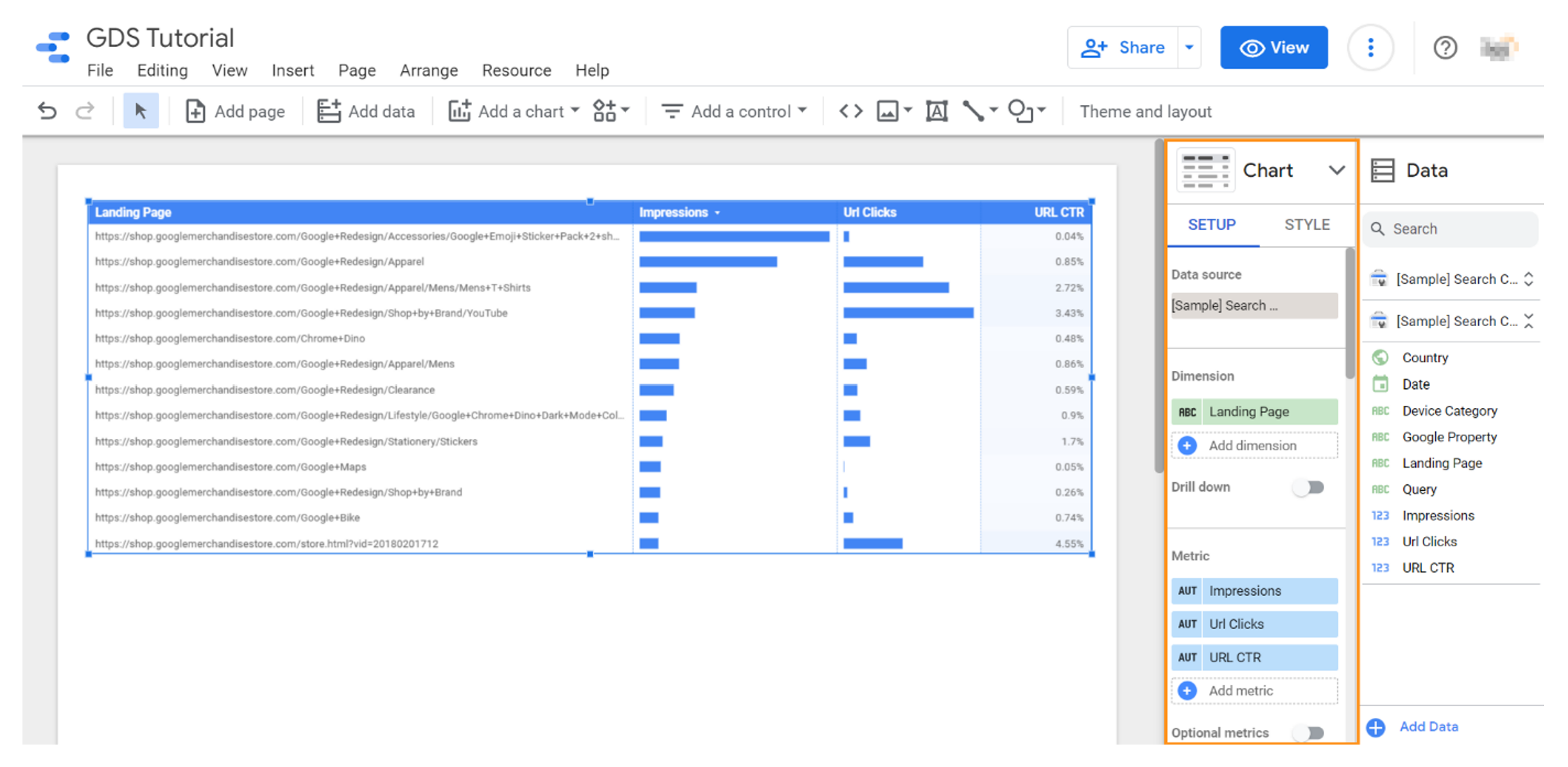
Google Data Studio: Customize how your charts visualize your data
If you prefer, you can also customize the theme and design of your charts by selecting the “Style” tab at the top of the chart customization panel.
WANT DIGITAL INSIGHTS STRAIGHT TO YOUR INBOX?
4. Make Your Report Interactive (Optional)
In Google Data Studio, charts don’t have to be static: You can allow users with viewing access to your report to filter elements and/or results to tailor their data viewing experience.
On the top toolbar, click “Add a control” and select the most suitable toggle control for your report filters.
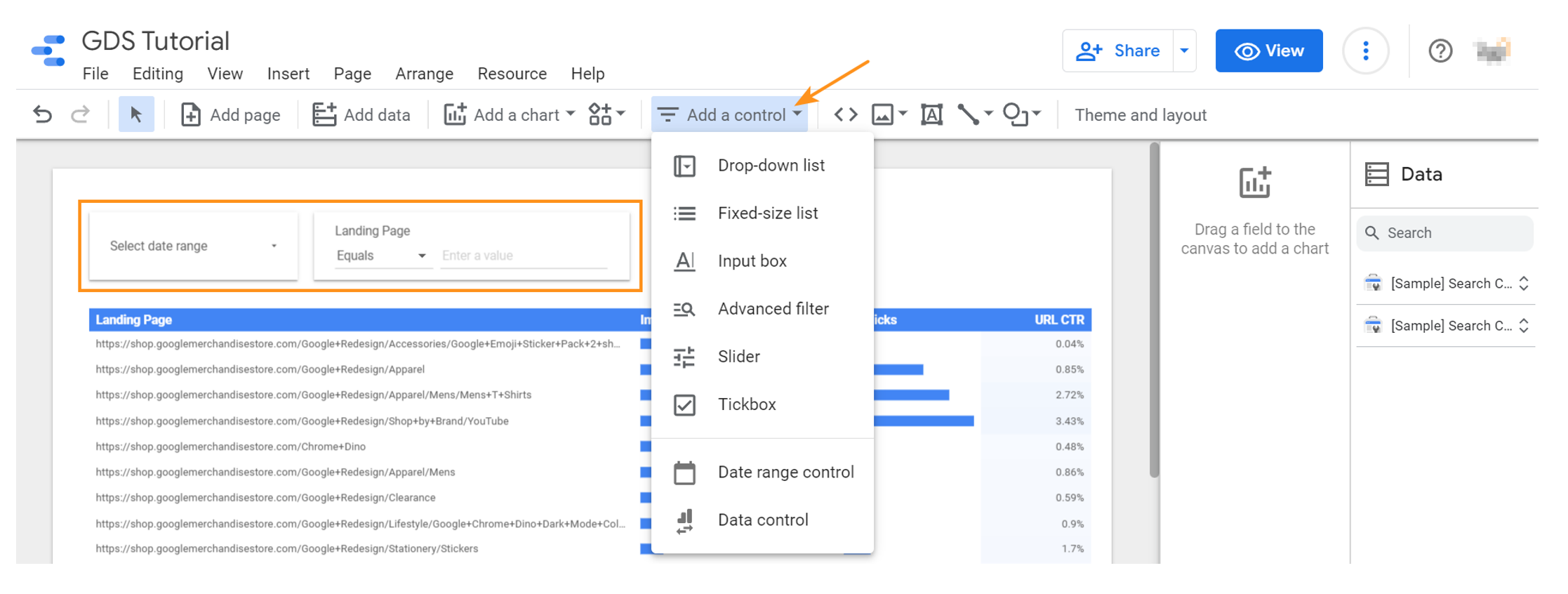
Make your Google Data Studio reports interactive by adding toggle controls for filters
In case you would like to let viewers filter data by specific dimensions, you can add an “Advanced filter” control.
“Date range control” is another useful toggle to add as it will let users view your data over a specified time period.
Upon creating a chart, its default date range setting will be set to “Auto”: This means that all charts set to “Auto” will automatically update the data it displays whenever users toggle the date range control.
Alternatively, if you want to generate data from a fixed date range on one particular chart, click into that chart, toggle the default date range setting to “Custom”, then set it to your preferred date range.
5. Share Your Report (Optional)
Now that you understand the components of creating a Google Data Studio report, it’s time to share your findings—whether that’s with your team, clients, executives, or anyone else!
But before you do, you may want to embellish your report by including images, adding text boxes for author notes, or using shapes and lines to draw attention to something—all of which are options readily available in the top toolbar.
Once you’re happy with your report, click “Share” on the top-right (just like with most Google products) of Google Data Studio’s interface and grant viewing or editing access to anyone you wish with a Google account.
***
With this step-by-step tutorial, we hope that creating a Google Data Studio dashboard from scratch will feel less daunting for beginner users or those who need a refresh. Follow our guide to get the most out of it and successfully show the ROI of your marketing efforts!
Ready to maximize your digital marketing in Asia?
Digital Marketing News + Insights