Adapting Keyword Research in the AI Search Era (GEO)

The age of the simple keyword search is over. Search still exists—but it’s now fragmented across traditional SERPs, AI-driven overviews, and conversational chat interfaces. For marketers and SEO managers, this isn’t a death sentence for SEO. It’s simply a call to evolve.
To stay visible, we need to evolve from SEO to SEO + GEO.
From Classic SEO to GEO: What’s Really Changing?
As LLM chatbots like ChatGPT become mainstream and AI is integrated into search engines, users no longer rely on a single-entry point. A typical journey might start with a Google search, utilising Google AI Overview, then continue with follow-up questions in Google AI Mode or an AI chat.
In other words, search is now happening on:
- Traditional search engines (Google, Bing, etc.)
- Generative search features (Google AI Overview, AI Mode, Bing Copilot)
- AI chat interfaces (ChatGPT, Perplexity, and others)
If your marketing strategy only optimises for the classic ten blue links, you’re now missing significant parts of that journey.
This is where GEO (Generative Engine Optimization) comes in.
GEO is the practice of structuring and optimising your content to be easily understood, cited, and trusted by AI chatbots and generative search engines (such as Google’s AI Overviews), ensuring your brand is accurately represented and consistently visible in AI-generated answers.
GEO doesn’t replace SEO. Instead, it forces our SEO methodologies to evolve. In this article, we’ll focus specifically on how to adapt your keyword research methodology to match the AI search reality.
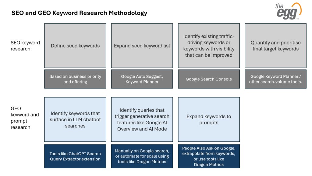
How We’ve Traditionally Done Keyword Research
Before we expand into GEO, let’s anchor ourselves in the process we already know.
We typically move through a few familiar steps:
First, we define seed keywords. These are broad, general topic terms—usually 1–2 words—that describe our core themes (for example, “CRM software” or “running shoes”). They often come with high search volume and high competition but have vague or mixed intent. Their main purpose is to act as a starting point, which we then narrow into more specific, intent-rich phrases.
From there, we expand seed keywords using Google Auto Suggest. We type those seeds into Google and note autocomplete suggestions and related searches. These variations reveal how real people refine their queries, helping us uncover long-tail, more specific searches that map better to user intent.
Next, we mine Google Search Console for keywords with potential improvements. We look for queries with high impressions but low clicks, or those where rankings are not yet on Page 1 and need improvement. This gives us a performance-based list of opportunities where a content or optimisation tweak can unlock meaningful gains.
Finally, we quantify and prioritise using tools like Google Keyword Planner and other third-party platforms. We assess search volume, competitiveness, and relevance, then choose a target set of keywords worth investing in based on potential impact.
This foundation is still valid. But in the AI search era, it’s not sufficient on its own.
How Keyword Research Expands in the AI Search Era
To align with how users search today, keyword research must now go beyond classic tools and SERPs. You’ll want to deliberately add three new layers:
- Identify keywords that surface in LLM chatbot searches (e.g ChatGPT Web Search)
- Include queries that trigger generative search features like AI Overview and AI Mode
- Expand from “keywords only” to include prompts
These additions are where GEO begins.
SEO + GEO keyword research process in summary:
1. Mining AI Chat: Extracting Keywords from ChatGPT
Many LLM chatbots still rely on web search in the background—but they don’t show you the queries they’re using. To optimise for this layer of search, we need to see those hidden queries.
A practical way to do this on ChatGPT is to use this Chrome extension: ChatGPT Search Query Extractor by LLMRefs
When ChatGPT (Mode: web-search enabled) answers a query, this extension reveals how it breaks that single prompt into multiple web searches.
For example, for this prompt “what are the best hotels in Tokyo for 5 day trip?”, the extension reveals ChatGPT breaks it down into 3 queries:
- Best hotels in Tokyo for a trip
- Top recommended hotels Tokyo
- Best hotels in Tokyo
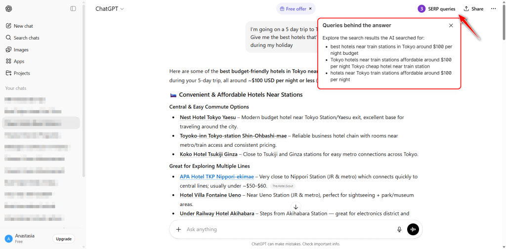
ChatGPT Search Query Extractor extension by LLMrefs showing ChatGPT breaking down prompts into keywords in Web Search mode.
You can:
- Enter prompts that reflect your audience’s information needs
- Observe the actual search phrases ChatGPT sends to the web
- Add those discovered phrases into your keyword list
This gives you a new perspective: not just how humans type queries into Google, but how AI itself translates natural-language questions into search-level queries.
2. Capturing AI Overview and AI Mode Queries
The next GEO layer is understanding which keywords trigger generative features like Google AI Overview and AI Mode, and whether you’re visible (cited or mentioned) there.
Tools like Dragon Metrics now support AI-focused research. You can, for example:
- Pull a list of keywords that trigger AI Overview to appear
- Filter that list to find cases where AI Overview appears but does not cite your site or brand
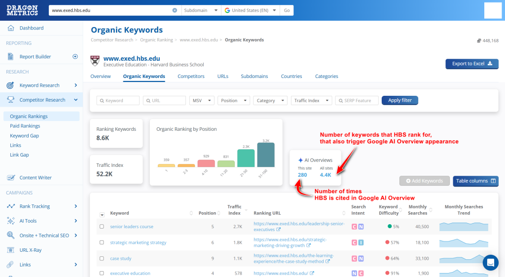
Dragon Metrics interface: A feature comparing keywords cited by AI Overviews for your website versus competitors’.
These are high-priority GEO opportunities, because:
- The user is already receiving a summarised answer
- Classic organic listings may sit below the fold of attention
- If you’re not being cited, your expertise is effectively missing from that first answer.
- Additionally, even though CTR drops when AI Overview is present, brands cited in AI Overviews still earned 35% more organic than those not cited.
Adding these “AI-trigger keywords” into your research set ensures you’re not only chasing rankings, but also citations and presence in generative search layers.
3. Moving Beyond Keywords: Why Prompt Research Matters
The third expansion is moving from pure “keywords” into prompts.
Prompts are how users give instructions to AI search. Because LLM-based tools like ChatGPT, Perplexity, are conversational, users naturally shift from short keywords to:
- Complex, multi-part questions
- Highly specific scenarios
- Natural, full-sentence language
Instead of “email marketing software,” a typical AI prompt might be:
“Recommend email marketing tools for a small ecommerce brand in Europe, compare pricing tiers, automation features, and how easy they are to integrate with Shopify.”
The intent is the same, but the structure and richness are different—and this is exactly what AI systems optimise for.
Understanding how your audience actually prompts allows you to:
- Track brand mentions and citations in AI answers for those prompts
- See which competitors are being referenced instead of you
- Identify content gaps where the AI gives answers but has no compelling reason to reference your site
Prompt research becomes both a measurement framework and an optimisation roadmap for GEO.
AI in Action
Search is now fragmented across traditional SERPs, AI Overviews, and conversational chat. At The Egg, we help you evolve from SEO to SEO + GEO, enhancing potential for AI visibility, citations, and brand authority across all AI-driven search environments.
How to Systematically Generate Prompts
You don’t have to invent prompts from scratch. You can build them in three ways.
First, start with People Also Ask (PAA). For your core keywords, retrieve the list of questions that appear in Google’s PAA boxes. These are your most basic prompts: real, user-generated questions that map neatly into AI chat style queries.
Second method is using an LLM to extrapolate prompts based on your audience and offer. Provide:
- Your audience profile
- Your product or service category
- Your core keyword set
Then ask the LLM to generate detailed, realistic prompts that your audience might use at different stages of their journey: problem-aware, solution-aware, and ready-to-buy. This gives you a prompt library that is aligned with both search behaviour and business strategy.
Third method is using Dragon Metrics’ AI Prompt Research. This feature allows you to discover prompts on ChatGPT and Google AI Overview that include certain terms and see how users frame their questions. It’s another way to move from isolated keywords to richer, context-layered prompts supported by real data.
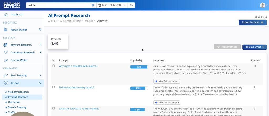
Dragon Metrics AI Prompt Research feature where you can enter a keyword and get a list of related prompts.
Combine these three inputs—PAA questions, LLM-generated prompts, and Dragon Metrics’ prompt discoveries—and you’ll have a robust prompt set ready for testing and measurement across AI search interfaces.
Quick Wins
3 Quick GEO Wins You Can Implement This Week
Not ready to overhaul your entire keyword strategy? Start here:
Quick Win #1: Install the ChatGPT Search Query Extractor (10 minutes)
- Add the free Chrome extension
- Ask ChatGPT 3-5 questions your customers typically ask
- Review the actual search queries it generates
- Action: Add any new keyword variations to your existing content calendar
Quick Win #2: Audit Your Top 10 Keywords for AI Overview Presence (30 minutes)
- Take your 10 highest-traffic keywords
- Search each in Google (incognito mode)
- Note which trigger AI Overview
- Check if your brand/site is cited
- Action: For any keyword where AI Overview appears but doesn’t cite you, that’s your priority optimization target
Quick Win #3: Mine 5 PAA Questions Into Prompts (20 minutes)
- Pick your core service/product keyword
- Extract the “People Also Ask” questions from Google
- Reframe them as natural prompts (e.g., “What is X?” becomes “Explain X and recommend the best options for [audience]”)
- Action: Test these prompts in ChatGPT and Perplexity—are you mentioned? If not, you’ve found a content gap
Combined impact: These three actions take only an hour but will immediately reveal where you’re invisible in AI search—and give you a clear starting point for GEO optimization.
Where to Go From Here
By this point, you should have:
- A traditional, SEO-focused keyword list
- An extended list of keywords drawn from LLM search behaviour
- A set of keywords that specifically trigger AI Overview or AI Mode
- A structured library of prompts that reflect how your audience actually talks to AI
The next step is to prioritise. Decide which keywords and prompts matter most to your business, then audit your current visibility:
- Do you rank in classic organic search?
- Are you cited in AI Overviews?
- Are you mentioned or linked in AI chat answers (like ChatGPT)?
From there, you can design GEO-led optimisation strategies to increase citations, strengthen brand presence, and align your content with how AI systems interpret and surface information.
You now have the research foundation. But research alone won’t get you cited in AI answers.
In Part 2, we reveal:
- How to audit your current AI visibility in under 30 minutes
- Tactical on-page optimizations that increase your chances of appearing in ChatGPT and AI Overview
Need help from professionals? Let’s audit your AI visibility now.