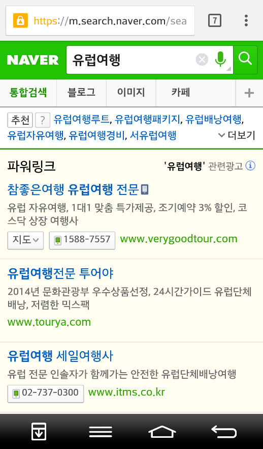
<src=”/wp-content/uploads/2014/11/naver-revamping-mobile-serach-design.jpg” />In a sneak preview on 20 November 2014, Naver was announcing a completely new mobile design revamp. As mobile usages and searches on Naver are overtaking desktop, it comes as no surprise that Naver will focus more and more on the mobile version of its website.There are a few changes compared to the design in the past, although not all of these changes are a result of this latest December 2014 overhaul.First of all, all paid content is easier to recognize compared to before, especially with the yellow background which was introduced back in September 2013 for the desktop. A very recent change, however, is the paid content section, as illustrated in the right screenshot below.

Another major difference between the desktop and the mobile version is the presentation of the category results. Whereas on the desktop version, all results are strictly presented in categories, the mobile SERP will provide a mashup of the best results of a mix of categories first, before showing the categories as we are used to from the desktop version. The left screenshot below shows the mashup where you can see the different categories highlighted in red. The right screenshot shows a one-category only section as we are used to from the desktop version.
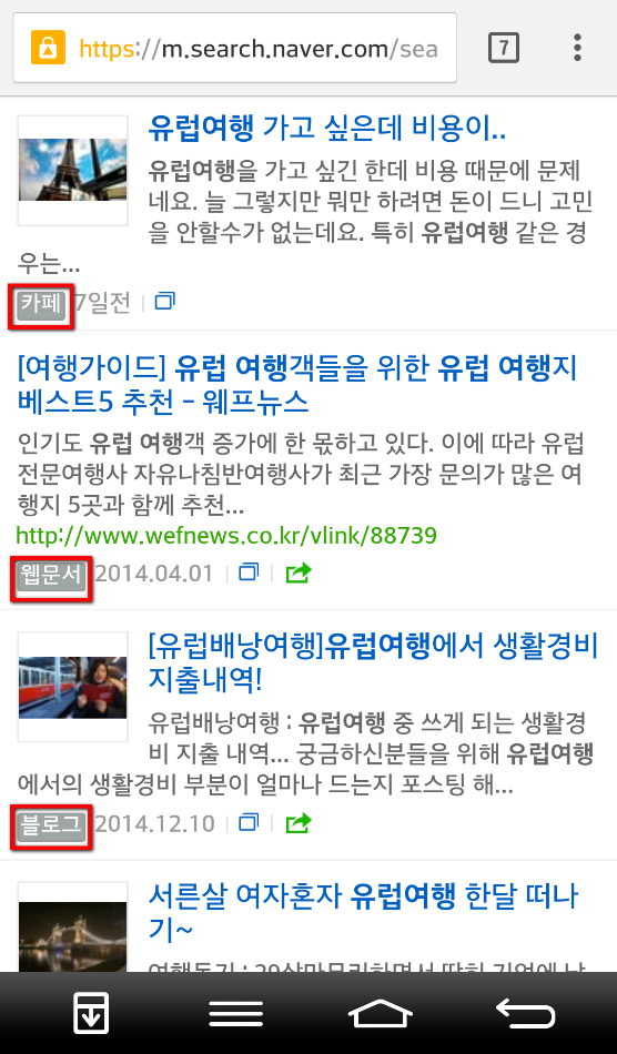
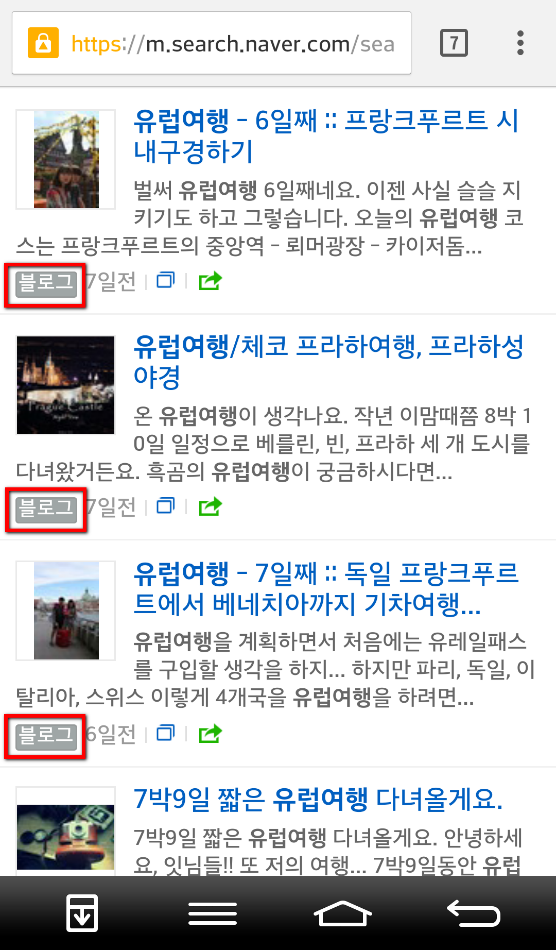
Mashup of mixed category results (Figure 1) Blog category results (Figure 2)
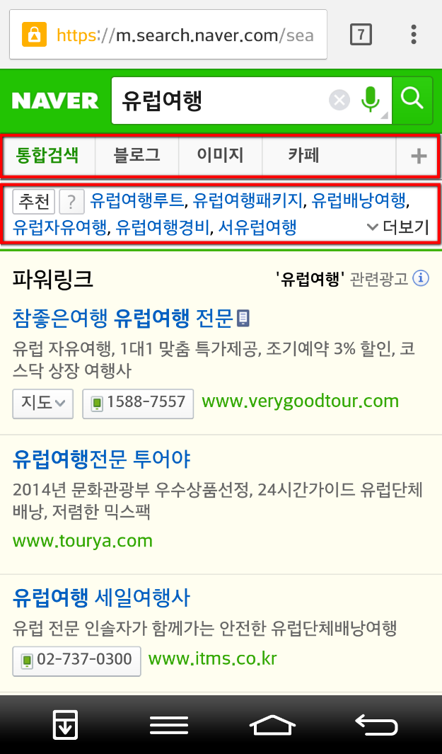
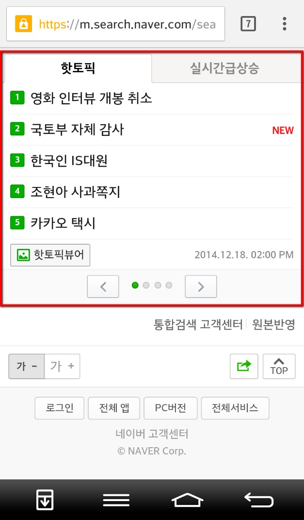
Other elements we know from the desktop version are pretty much the same. First, there is the category selection and the recommended keywords at the top of the mobile SERP (left screenshot). And then, there are the hot topics and real time trending keywords which can be found on the right side on the desktop version, but at the very bottom of the mobile version (right screenshot).
Almost all elements available in the desktop version can be found on the mobile version in a sometimes even cleaner and less cluttered way. The mobile only cross-category mashup is also a very interesting addition. From an SEO point of view, however, two things are very challenging. First, the rankings of the above-mentioned category mashup, which (mostly) appears on the top right after the paid results, are very not transparent and don’t seem to follow any obvious logic. The highest ranking blog article in the mashup of mixed category results (Figure 1 above), for instance, only ranks 18 within the blog category results (Figure 2 above). Second, for some keywords, paid results are simply too dominant. For some highly competitive keywords, it takes two full mobile screens before the first non-paid results are shown. Other than that, the latest design changes can be rated as intuitive and user-friendly. Looking at the latest usage trends, it is highly likely that Naver will focus more and more on the mobile experience.